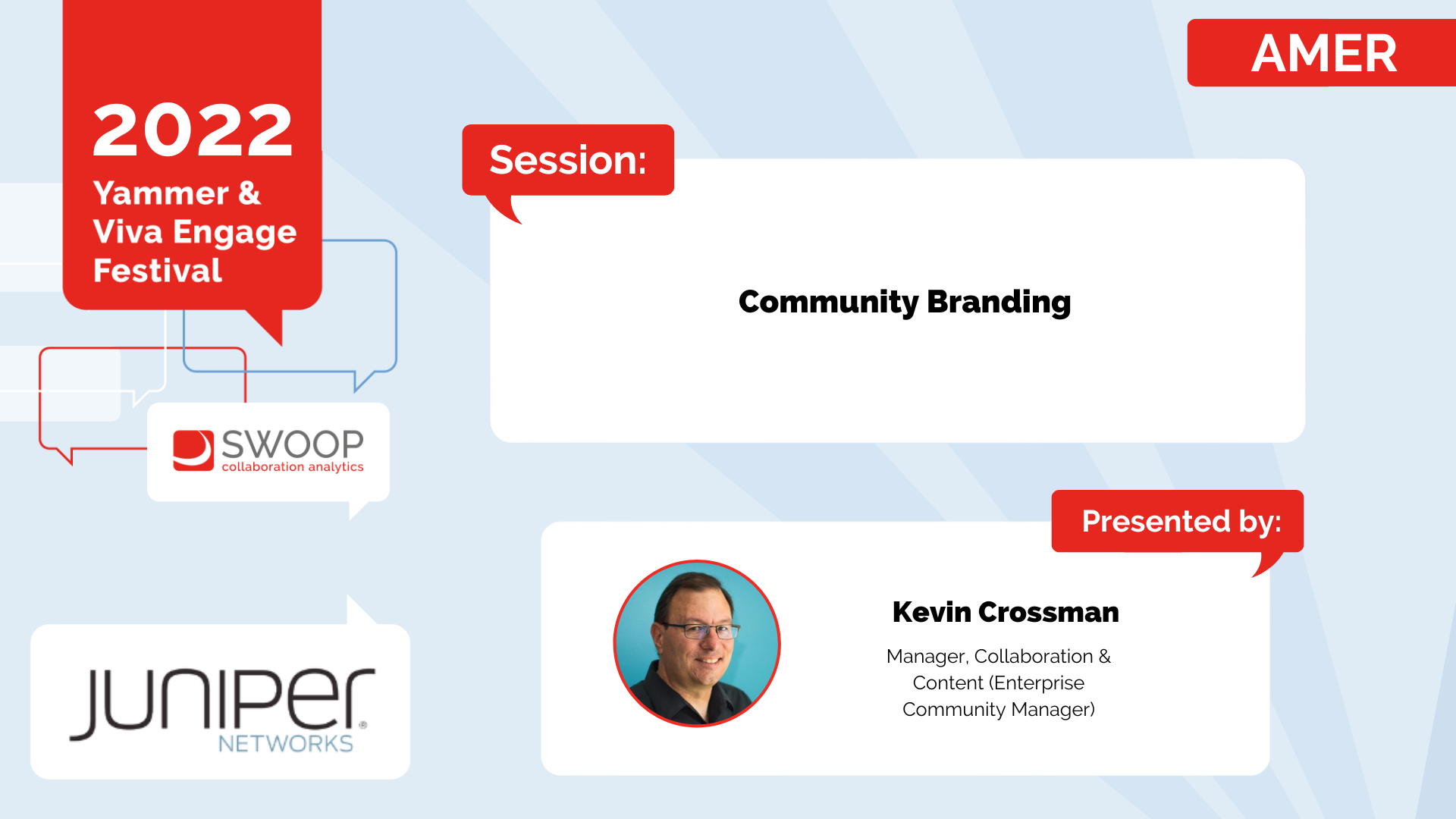
Juniper Networks: Community Branding
AMER | Yammer & Viva Engage Festival 2022
Join Kevin Crossman from Juniper Networks as he takes you through the visual design of the community icon and cover photo as a key method to reinforce organizational culture and to build confidence with users. Viva Engage displays the icon and cover photo differently than in Yammer, causing community owners to reconsider the imagery used previously. In this session, Kevin will discuss these considerations and share some examples of effective community branding elements, approaches to community types, and an example style guide.
-
Up next, we're in for a treat. We have Kevin Crossman from Juniper and he's going to be sharing about branding. So Kevin, I will hand it over to you.
Alright, hey, thanks for having me and thanks everyone for sticking to the end here. We're going to talk about some community branding guidelines for Yammer and Viva Engage. And why is community branding important? Because the branding sets the tone for your communities, and when you land in a community or you see it in the list of communities, the branding is really important.
Does this look interesting? Am I energized to want to join it? Can I trust it? Is this a fun community or a serious community? The branding can help set those tones and with all due respect to our friends at Microsoft, this ain't the way. People are not going to click on communities in the list when they don't have any customizations. When someone comes to a community that doesn't have any customization for the icon in the cover photo, they're going to think that maybe it's not really managed or whatever, so branding is really important.
Additionally, Viva Engage has added some new complexities, not just with naming conventions, but in terms of how these communities are presented in the user experience. So most notably, they're presented on that right side, on white with no name by default. So the community icon is really important if people are trying to find their community in Viva Engage.
And you know, it's presented on white, so if your icon is white, it ain't going to pop. And you know, if it's a photograph, it may not look much like more than a colorful blob. So and you know, we know that many communities still haven't updated their cover photos, even though new Yammer has been here for a couple of years.
So it's really important to help you know your community admins to, you know, get these things going because it gives people more trust in their communities. Microsoft has put this out as an example of communities, and I don't think it is a very good model. The photographs are not terrible, but I think those community icons could be really improved.
And just to show an example. Of something that could provide a more cohesive and familiar experience. This is a selection of communities in our actual network.
I do believe that colleagues will feel more comfortable when they see their organizations branding reflected in the communities. So the talk today I'm going to run you through what we did at Juniper and we developed a community branding guidelines PowerPoint. Our marketing team and me as the IT service center for the platform put this together and these are for the most part the actual slides from our actual guidelines for our users that I then as the service owner would work with community admins and things like that.
So we started first by defining two types of communities. We define corporate communities as being the sort of the bigger ones, the most important ones tied to business processes tied to the CEO and executives' official communities. Now that we can actually mark them in the platform.
You know those kinds of communities versus other communities which are end user led, probably more around communities of interest or clubs or affinity groups or most socially focused communities, that sort of thing. And you at your organization may make some additional distinctions in the may define some branding for each of those community types, but we chose to and the guidelines kind of go through how those how those look.
First, with corporate communities, you know we talked about the cover photo and the community icon and for us cover photos for community for corporate communities are black and white grayscale photos. That sort of thing. It's OK for, you know, sort of like graphics to be used if it's aligned to the community's purpose or program or something like that.
But generally speaking, we're talking about photos in black and white. And then the community icon is an icon style white on our juniper green color, which is our primary color. You can see that it's even reflected in our Microsoft 365 branding there.
So we talk about that being the things we're talking about, and then we give some specs. You know that cover photo is pretty wide, pretty wide image 1360 by 550, so we provide that to folks, so they get an idea of what they're working with. And then you know the community icon.
It's a square image and really any square image would work. Microsoft put out 85 by 85 a couple of years ago as being the spec, but I think it's a little too small and pixelated, so I put 170 by 170. And then we put it all together again, reinforcing these things, showing how the you know the icon sits on top of the image and all that sort of thing.
And then we do basically the same thing for other communities. So in our case, other communities. That's where you want to use color if at all possible for the cover photo.
Could be a representation of the community members or something like that. We suggest you might change the cover photo with the seasons or around events or campaigns or simply to show something new. And as an example for our photography club, what we do every two or three weeks is change the cover photo to represent an actual photo that someone is actually posted in the community.
And of course, we give them some attribution and little kudos and all that sort of thing. Gives people something to look at and appreciate in this photography club. And then for the community icons for these other communities, they can be again the same icon style.
Use any color from our color palette, which I'll show you in a second, except do not use juniper green and they can be either white or black depending on the cover. The color they're sitting on top of or how it looks. Again, same thing we provide those specs.
We do the same thing. Put it all together on, you know a little summary here and then this is our community icon template in which shows all the colors. A reminder to not use white.
So the idea is that if you're if you got a little icon you can just in PowerPoint just drop it on top of one of these squares. Take a little screenshot or select both the elements and do a save as or whatever and you've got your community icon that as a community admin you can upload right away. So we have a you know these are all color you know approved colors.
We again reinforce that the green should be with a black and white photo and not with a color photo. You know, if we've had certain corporate events, I'm not such a stickler on that. If they use the color photo, if it's related to a company quarterly meeting or something like that, but generally speaking, we want to separate these out and this is a reinforcement.
In the deck I provide a page or a slide here with two big examples where people can drop icons on here for testing and how do they look and all that stuff. And you know that the icons that come in PowerPoint are actually really really good. When you say insert icon, it gives it gives you a nice panel where you can browse or especially search for icons, and there's a lot of choices there really, really good.
So putting it all together, this might be a little hard to read, but the point is that if I'm browsing in my actual network using this sort of branding, it's pretty easy for me to see and differentiate between these communities just by looking at the icon, even if I haven't expanded the name field. So if I'm looking for the photography club, it's pretty easy for me to find the little community with the camera icon. And I do think that logos if you're for your communities or company logos, things like that can be useful and familiar as well.
We do that with some of our communities like Mac OS, iOS, that sort of thing. We also give people a little bit of the hard truth that you know it's not always so simple. So as an example, when you view the cover photo in your community in desktop versus mobile, the cover photo is cropped on the sides in the mobile experience.
So if you've got something like text in your cover photo, that could be an important distinction. So we provide an example of that. Additionally, we've engaged when they present their communities.
Those cover photos are additionally cropped both on the sides and on top. So depending on what you're trying to do, it may not be a big deal if it's just a bunch of trees. The trees get their heads cut off.
It doesn't really matter. Maybe the executives. It's not so bad if you, you know, miss the top of their heads, but if it cut off their faces it would probably be worse, right? And then of course if you've got text on these things, getting it into that sweet spot knowing that you know the icon is going to be sitting there too, can be a little bit tricky.
So I've put together this as an example. Where is your sweet spot? You know this is kind of what it looks like if you take the average cover photo image. So keep those things in mind when you're developing cover photos.
And again, if it's a photograph of a bunch of trees or something like that, doesn't really matter. In our guidelines, we also present some information about where they can find these kinds of resources. Obviously for photos you could take your own photo.
The hub is an internal tool that we use where we have stock photography, brand photography, brand assets and all that sort of stuff for our employees to be able to download. So that's obviously a great source for those folks. And we do have some users with Adobe and Getty Images accounts, so we make you know reminders that those are available.
I mentioned the PowerPoint as an example in Juniper's official PowerPoint deck or template. We actually have a section of icons that people can use for decks and things like that, and obviously, those things could be used for icons for their communities. And then Lastly, we end the deck.
With a little reminder that we do have a setting up a new Yammer community tutorial which talks about a bunch of things including branding, but including things like making sure you have a welcome post and fill out the description and information panel and all those kinds of things. And of course that our IT collaboration team is available for any assistance. Any of this stuff.
So we do have just a question here that came up from Ty. Is the grayscale versus color scheming on Yammer consistent with Juniper's color palette is treated in other digital workspaces? Yeah, that's a great question and I think we a couple of years ago, especially when this was developed in 2020, the company as a brand was using more of that grayscale thing and they pivoted a little bit in 2022 to be trying to lean in a little bit more into some color things. But that being said, I think that the grayscale thing does reinforce maybe a little bit more of a seriousness that these sort of official or corporate communities tend to play.
So and just as a way to differentiate them because everyone, unless you're colorblind, of course, can see, you know, there is kind of a visual difference there. So it's not like I said it's we don't hard, hard, hard enforce it just as a guideline though. And then any reason why the hero picture should be in grace in the grayscale? Again, it's just a styling thing to style anything.
And again, you know every you know, just as a way to differentiate these things especially, but you may come up with your own things. You might come up with some guidelines or something like that. You know, sample cover photos, things like that could be a good thing to provide as well.
And then do you provide employees with guidelines for their personal cover photos in Viva Engage? We do not allow people to change their cover photo in Viva Engage because that is going to be a premium feature that we probably aren't going to buy at the Viva Suite pricing. So no.
Meet the speaker:

Kevin Crossman
Manager, Collaboration & Content
(Enterprise Community Manager),
Juniper Networks

More from Yammer & Viva Engage Festival: