How to really know if your communications are making an impact
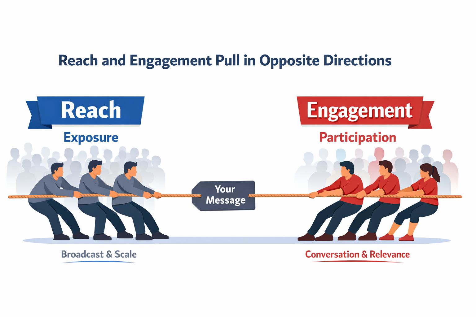
Why the quest for Reach is killing Engagement
(and what internal comms can do about it)
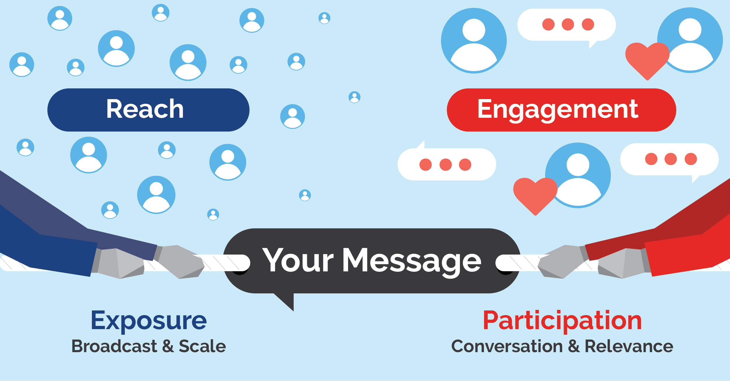
On any employee engagement platform, what ultimately drives impact isn’t how many people see a message, it’s how people engage with what you post.
Internal Communications can help change behaviour when people participate, but it can’t when people are just passively reading.
The problem is that many of the metrics internal communicators rely upon don’t clearly separate these two things.
Measures such as Reach or Seen tell us how many eyes were exposed to a message. They tell us who noticed it. But they don’t tell us who actually got involved.
When we can measure participation - how many people engaged by replying or reacting, and how many unique individuals took part - we can distinguish exposure from impact. At SWOOP Analytics, we refer to these participation‑based measures as “Engagement” and “People”, and they reveal a very different story about what’s really working.
This distinction between exposure and participation is exactly what we set out to examine by analysing how employees actually behave on Microsoft Viva Engage.
What does the data tell us?
We analysed 520 internal threads on Microsoft Viva Engage across 52 organisations, using four metrics: Reach (% of audience who saw the post), Seen (unique people who saw the post), Engagement (% of people who reacted or replied) and People (number of unique participants).
For each organisation, we selected the top 10 Most Engaging Posts to give us a picture of what this looks like for high engagement posts.
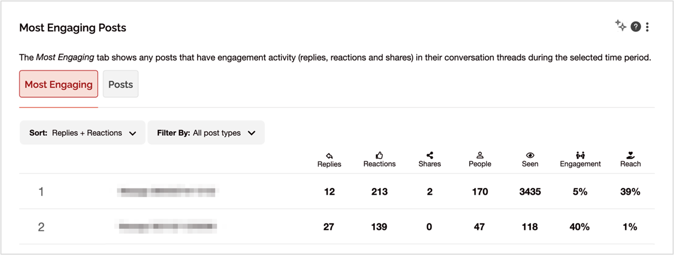
A screenshot of SWOOP Analytics for Viva Engage’s Most Engaging Posts report.
Across the sample of high-performing content, the simple averages look like this:
Average Reach: ~29%
Average Engagement: ~7%
These numbers are useful. But only if you understand what they represent. They are not targets. They describe what high-performing internal posts typically look like today:
That ~29% Reach reflects content distributed to sizeable audiences.
That ~7% Engagement reflects what happens next: a small fraction of people actively participates, while the majority scroll past.
In other words, these averages mostly describe exposure, not impact. This is where the Broadcast versus Conversation distinction becomes critical.
When you’re doing Broadcast comms, you should expect:
Reach around or above ~29%
Engagement around or below ~7%
That’s normal. That’s what scale looks like.
When you’re having a Conversation, the pattern flips:
Reach is intentionally lower
Engagement should be meaningfully higher than 7%
People (count of unique participants) becomes the primary success metric
So instead of asking; “Did we hit 7% engagement?”, a better question is; “Did we want broadcasting or conversation?”
If you wanted to broadcast, then judge the message on clarity and reach. If it was conversation, judge it on participation.
Have another look at the screenshot of Most Engaging Posts above. Notice the first post represents Broadcast comms, and the second one is a Conversation. The first post reached a large audience, but Engagement was low. The second reached a tiny audience, but Engagement was high.
Trying to maximise Reach and Engagement at the same time is usually unrealistic. It’s like asking a town hall and a workshop to behave the same way. They won’t. In fact, we found a significant negative correlation between Seen and Engagement.
Translated into plain English: The wider you distribute a message, the lower the engagement rate becomes. Not because the content suddenly gets worse, but because relevance doesn’t scale.
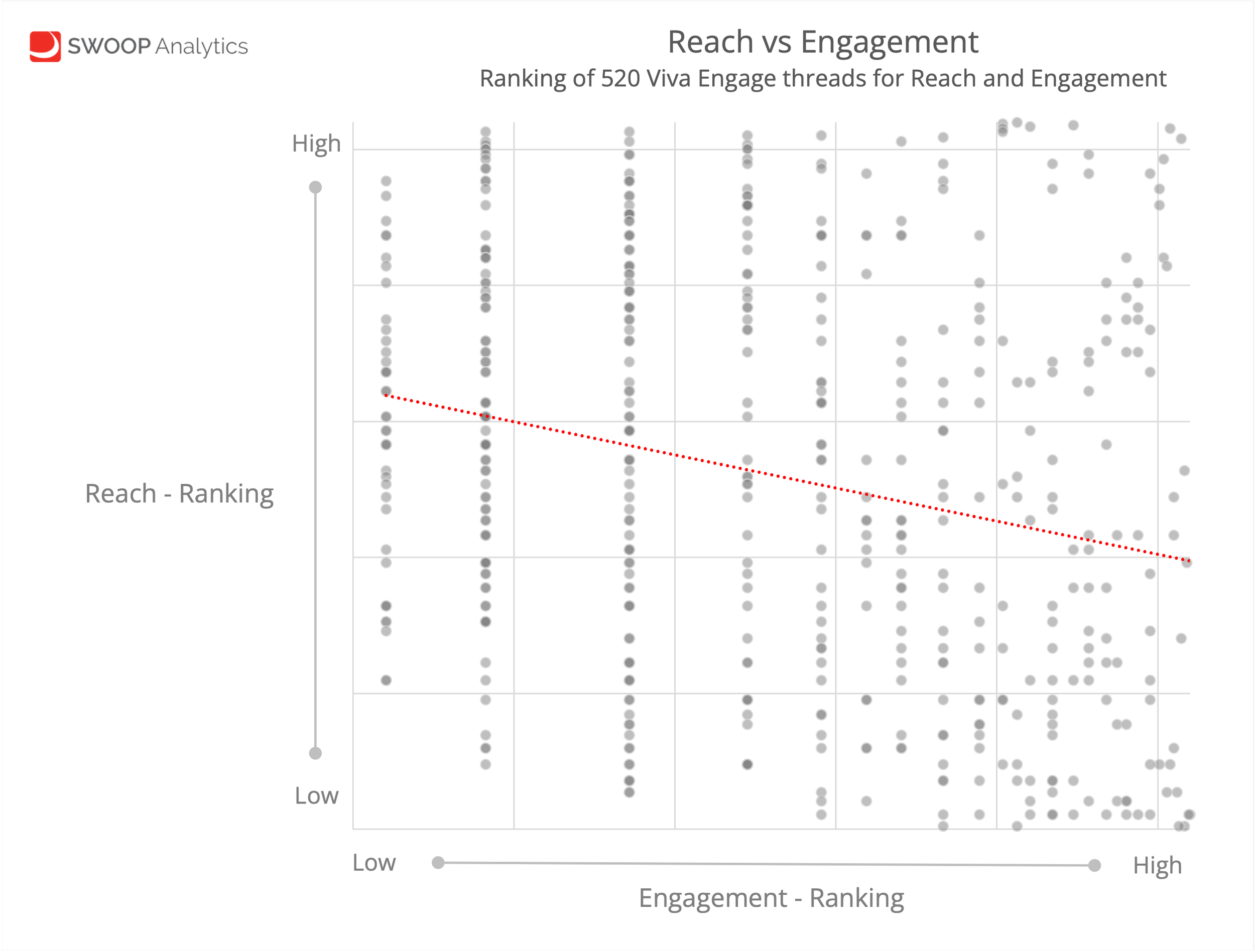
520 threads on Viva Engage ranked on Reach versus Engagement.
Your most interested audience engages first. As distribution widens, you reach more people for whom the message is less relevant, less timely, or simply background noise. Participation grows, but exposure grows faster. This creates a dilution effect.
Broadcasting increases the number of people who participate but reduces the proportion of the audience who do so. This pattern creates two very distinct modes of internal communication:
Broadcast
High Seen / Reach
Lower Engagement
This is exposure. People notice the message, but most don’t interact.
Conversation
Lower Seen / Reach
Higher Engagement
This is relevance. Fewer people see it, but more of them care.
Neither mode is inherently wrong. Some messages must be broadcast: leadership updates, compliance notices, safety information. But if your goal is engagement, broadcast tactics work against you: You cannot optimise for scale and participation at the same time.
This matters because many internal communications teams are unintentionally rewarded for Reach, while being judged for Engagement. That’s a structural conflict.
And it explains why information overload keeps getting worse. When Engagement drops, the instinct is to push harder and wider. That increases exposure, further dilutes relevance, and reduces engagement even more. A perfect feedback loop of noise.
What can we do about it?
What can internal comms teams actually do differently?
Here’s a practical checklist.
☐ Be clear on intent
Ask; “Am I trying to inform, or am I trying to involve?”
If it’s information, accept lower engagement and focus on clarity and visibility.
If you want engagement, design for participation from the start.
☐ Define the real audience
Not “everyone”. Who actually needs this? Who can act on it? Who is affected? Smaller, relevant audiences consistently outperform large generic ones.
☐ Design for contribution, not consumption
Announcements get exposure. Questions get responses.
Instead of “Here’s an update”, try:
“What’s your view?”
“How is this landing in your team?”
“What would improve this?”
Make the first interaction easy.
☐ Look at People before Engagement %
People is the number of unique humans who participated. That’s your strongest signal of impact. A post with 50 active participants can matter more than one seen by 5,000 with two reactions.
☐ Treat low Engagement as feedback, not failure
Ask; “Was this relevant? Was there a clear action? Was the timing right? Was it competing with other messages?”
Don’t default to reposting louder.
☐ Resist the “push everywhere” reflex
More channels usually means more passive exposure, which mathematically lowers engagement. Choose the right channel for the right audience.
☐ Separate broadcast from conversation
Some content needs scale. Protect space for discussion. If everything becomes an announcement, participation dies.
☐ Measure and review weekly, not quarterly
Look for patterns. Which posts triggered participation? Which ones just accumulated exposure? What themes consistently create conversation? Small adjustments compound quickly, so you need to act fast to adjust course.
Without good analytics you aren’t able get these insights, so you are effectively flying blind. However, SWOOP Analytics’ Most Engaging Posts is just one of many powerful reports that makes these insights available at your fingertips. You can quickly tell where you are broadcasting and where you are having conversation.
Final thoughts
The organisations that cut through information overload are the ones that stop chasing visibility and start designing for relevance. And that starts by using better metrics.
Microsoft’s out‑of‑the‑box analytics are not wrong. They’re just optimised for a different goal. They are designed to show platform usage at scale: who saw what, how often, and across how wide an audience.
But internal communication is not a software adoption exercise. It’s a behavioural one.
If success is defined by Reach alone, teams will keep broadcasting. If success is defined by surface‑level Engagement %, they will keep chasing averages that were never designed to guide action.
And if People - the number of real humans actively participating - is buried or ignored, relevance will always lose to volume.
This is where SWOOP Analytics is fundamentally different.
SWOOP Analytics is built on years of research into how employees actually behave on platforms like Viva Engage. It is designed to help internal communication teams distinguish broadcast from conversation, visibility from impact, and activity from participation, so they can set clearer goals and make better decisions, week by week.
If your organisation is serious about reducing noise, increasing relevance, and designing communication that people actively engage with, then the first step is simple:
Stop measuring what’s easy.
Start measuring what matters.
That’s the difference SWOOP Analytics brings.