Relationship Mapping and Monitoring with Yammer

Yammer is a leading social networking platform for use inside organisations. Its recent acquisition by Microsoft is not only good for Yammer, but for the many Microsoft Enterprise clients who have been struggling to 'connect' via Sharepoint. What is most exciting for us is that the combination of Microsoft's Active Directory with Yammer's conversational platform now provides a real opportunity to implement the 'Real-time Social Business Dashboard' which will enable enterprises to move beyond their current process monitoring to see how people are really collaborating (or not) to meet organisational objectives.
So what's wrong with the analytics that Yammer currently provide? Well nothing really, other than the fact that it's only using a proportion of the intelligence available from its tracking data. Like most of its competitors, the analytics are what we would call "ego-centric". In other words, they track the activity patterns of individuals and then aggregate the data at team, department, company level to assess the level of engagement (read usage). The knowledge management community learnt a long time ago that activity doesn't always map to productivity. Setting performance measures against 'documents submitted' resulted in lots of poor quality documents being uploaded just before performance appraisal time. But ego-centric measures will still reward this. In the social media space, numerous postings in forums or voluminous tweets provide little indication of effectiveness unless they provoke a response. Social network measures focus on the relationship. Relationships are jointly owned. A direct response to a post creates a relationship. A heavy interchange of messages infers a stronger relationship (not necessarily friendly, but still a more established one than where no interchange has occurred). A 'like' is also a connection. Counting 'likes' can be good for the ego, but even better when we know who is doing the 'liking'.
The Social Business Dashboard has 'relationships' at its core. That is not to say that current ego-centric measures would not be included. For example the volume of posts is clearly a useful indicator of activity. However social business is about collaboration. 'Connected activity' is what we are looking for, as we know that this form of activity is what leads to high productivity. The key component for a Social Business Dashboard is the Social Network Map. The map makes visible the network connections exposed through Yammer. By analysing the map one can see the flow of knowledge and information across the organisation. Accompanying analytics can identify who your key talents are, not by their CV, but who actually seeks them out for advice. We can identify the level of reliance on key players, the level of cross department collaboration, the areas where there may be bottlenecks impacting on customer service, order to cash cycles, ideas to innovation cycles and/or prospect to client conversions.
We have written previously about how network analytics can predict higher levels of efficiency, effectiveness and innovation, how social business drives ROI and what we are calling Social Analytics 2.0. We think this new relationship between Microsoft and Yammer will pay dividends by bringing 'Social' into mainstream enterprises, flagging a maturity in the market that we have long waited for.
Example Yammer Interactive Social Network Map
Below we provide an example Social Network map derived from a Yammer installation. The context was an "open innovation jam" where participants were drawn from across businesses to explore new energy and sustainability ideas and opportunities. 'Connections' are drawn from the Yammer discussion forum data. Fictitious organisation names have been added to provide an illustration as to how Active Directory profiling information would be included in the map.The Optimice Webmapper utility enables one to interactively explore a social network map. The 'flyout' menu (use the orange triangle to control) allow you to select what attributes you want to colour (Organisation or Explore-Exploit) and/or filter the nodes by.
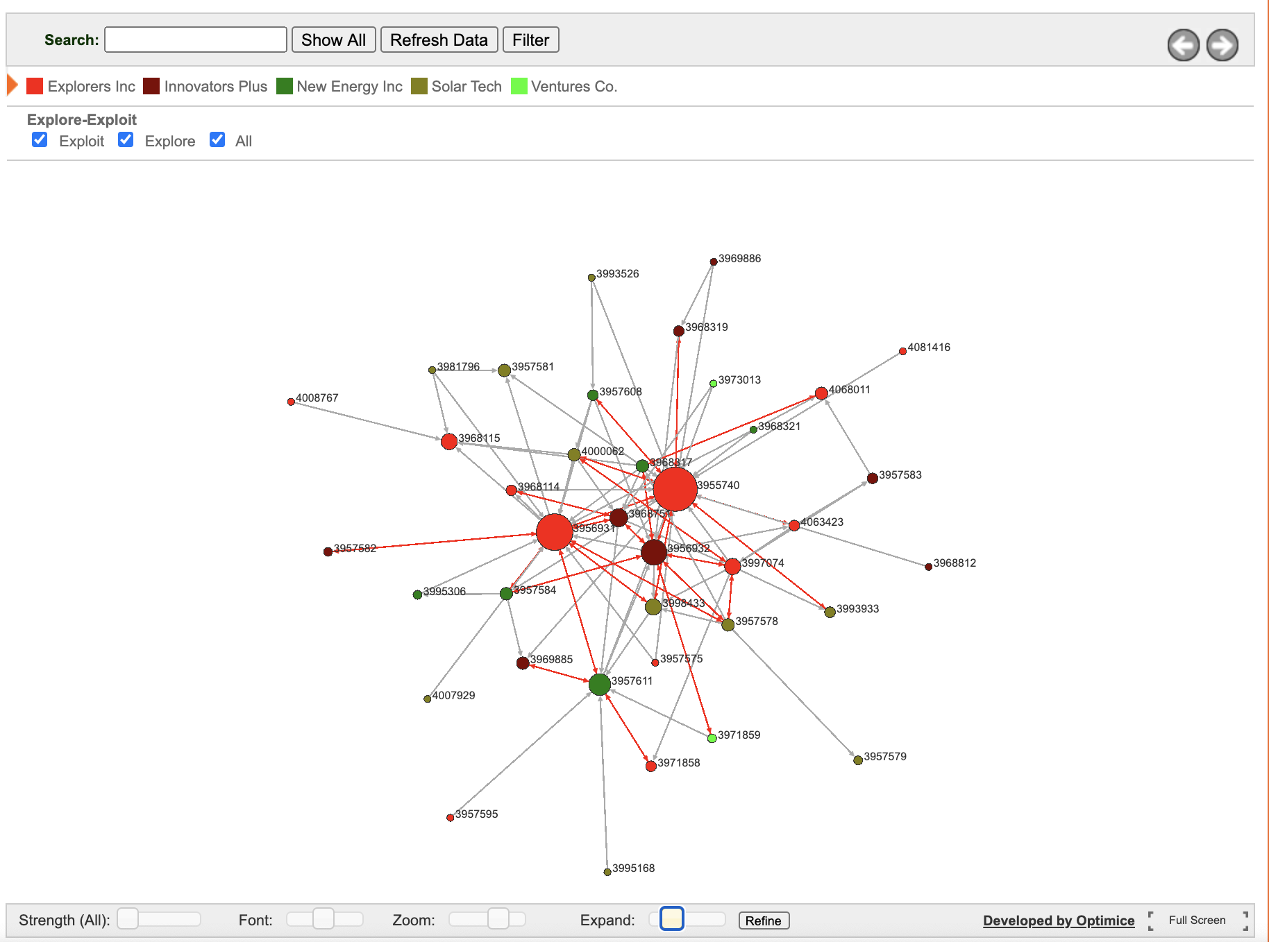
The initial scenario shows the 'Relationship Strength' map. The strength is determined by the number of posts made between pairs of participants. The size of the node relates to the number of posts received; a possible indicator of influence. Moving the strength slider from left to right exposes only the strongest connections. The red links identify reciprocated postings. We like to think of these as another indicator of relationship strength. You can use the explore-exploit selectors to show only the explorers, or only the exploiter organisations. Clicking on any individual node will expose the network for just that individual. Select 'Show All' to restore the map. You can use the flyout menu to change the filter to 'Organisation'. You can imagine how a dashboard might show this map evolve in real-time, while allowing analysts to 'replay the past' to diagnose impending issues and/or opportunities.We are currently looking for organisations that have successfully integrated Yammer into their Microsoft Enterprise environment and are interested in pursuing a 'Social Business Dashboard' strategy, as described above.
Contact us for more information.